Building a High-converting Form

Example of a high-converting form

Each landing page element is at least important, but some of them are decisive – like a form. The design, copy, and visuals are meant to convince visitors to convert into leads and – eventually – customers. In contrast, the form marks the last step of this process, so you’ve got to make it easy for your visitors.


How to do so? I’ve got 6 valuable tips for you. Follow them, and you’ll be able to create user-friendly forms that will provide a significant number of conversions.

Types of conversions

Before you dive into form-building, let’s learn more about types of conversions.

Primary conversion happens when the customer is far in the decision-making process – for example: after the free trial or after reading and watching a bunch of reviews of a chosen product. The customer now knows more and is ready to buy. That type of conversion rarely happens on landing pages, but you may get primary conversions at the final step of the funnel if you build funnels with them.

Secondary conversion takes place on previous customer journey stages – while they still seek the best choice. Actions performed on landing pages are usually secondary conversions.

There are also macro-conversions and micro-conversions. The macro-conversion represents your ultimate goal (e.g., turning a website visitor into a paying customer). Each step a user takes toward or is related to fulfilling an ultimate goal makes up a micro-conversion (e.g., contacting the sales team, adding a product to a cart).

Now that we’ve got this covered, let’s get to the tips to building high-converting forms.

Chart explaining primary and secondary conversions

Long or short form? Choose wisely

There’s no such thing as a perfect length of a landing page form. Sometimes you’ll need it to be as short as possible – especially when the landing page is about something simple, like newsletter sign-up or ebook download. Ask yourself: what user data do you really need at this point? And create a form that requires no more than that – the more information you want to get, the harder it is to convince people to share them.

But that doesn’t mean long forms are always a bad idea – sometimes they’re even necessary, like when users buy a specific product directly from your landing page. They can choose color, size, quantity, add their home address and phone number, and they won’t hesitate to do so because that’s required to place an order, and they know it.


Also, if you need to gather a lot of information from your visitors, but you don’t want to scare them with a super long form, you can create a simple funnel, asking for data gradually, a bit more on every step of the funnel.

Don’t underestimate the power of a form headline. You can include some important information there, like “Only 1 Email Weekly”. Surprisingly, that may be the game-changer, as it promises customers that they won’t be flooded with unwanted emails (lots of people don’t like it). Remember, though, to keep your word.

Copy on a form? Why not?

Let people know which kind of information you want them to fill in a specific form field. Sometimes it can get really tricky, especially when they have to fill a long-form. Some landing page builders allow you to write prompts inside form fields to save space – it’s an excellent, handy way to reduce form size.

Add some help

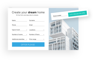
While filling out the form, users need to be focused, so make sure your landing page won’t make it harder: create a separate section for the form or – if for some reason that’s not the best idea – use contrasting colors.


The button should be the central point of the form, so make it stand out. Remember to use the colors from the template palette – a form should be an integral part of your landing page, not something attached to it.


Also, avoid black, brown, and white buttons – studies show that such colors work poorly on landing pages. They’re barely visible, and some people may consider them boring. Needless to say, your offer should be far from boring, so use energetic, vivid colors, like red, orange, green or yellow.

Avoid distractions

Check the form on mobile

Mobile responsiveness rules, and we all know that, but it’s easy to mistakenly think that the form is a closed widget, which would look exactly the same on desktop and mobile devices. Adjust its size, layout, or even the number of fields to make sure it will run smoothly for smartphone users.

Thank visitors for conversions

If you’ve acquired the treasure of a visitor who read through your landing page and has successfully filled out the form, you need to appreciate that. Create a simple thank you page where you’ll leave a message for those who decided to convert. Lots of great landing page templates come with equally great thank you page layouts, so you won’t need to design yours from the beginning in most cases.


Thank you pages are also a great way to direct the newly acquired lead or customer to another place, where they can continue bonding with your brand – a blog or YouTube channel.

Share Your Thoughts and Get a Free Landing Page Checklist!

Let us know what you think about Landing Page Academy, and we’ll send you a handy Landing Page Checklist in return. The checklist will help you make sure your landing page is ready to rock!

DOWNLOAD

FREE PDF

Takeaways

Getting the form right might make or break the conversion rate on your landing page, so it's immensely important to spend some time on it. Here is the short and sweet of today's lesson:

1. Determine, which type of conversion you are after on your landing page.

2. Adjust the length of the form accordingly.

3. Ask only for the data you need.

4. Make sure the form is mobile-ready.

5. Create a thank you page.

Setting up integrations

Next lesson

Landing Page Academy

More lessons

What's next?

This is the last lesson of this Chapter, so you know what happens next – the test.
Not ready yet? You can always go back and read the previous lessons before taking it. Good luck!