Designing a Landing Page

Example of a landing page design

In the previous lesson, we talked a lot about writing for a landing page. Now it’s time to learn about its visual side – we’ll cover CTA buttons, colors, widgets arrangement, picture selection, and more. After all, you need to wrap the copy you wrote in an appealing package, but before it happens, it’s always a good idea to create a mock-up.

Plan your landing page

It’s easy to find a proper place for a headline, but every other element may be arranged in any way. It gives you a lot of possibilities, but it also makes way for mistakes. To avoid building a non-intuitive landing page, start with a mock-up – a simple drawing of your future landing page, with all the elements arranged any way you like. Most landing pages feature a drag & drop interface as well as an option of splitting sections into two, three, or even more parts, so it shouldn’t be challenging to recreate the mock-up..

Keep in mind that each landing page can and should be optimized – both before and after publishing – and that also refers to the design part. Various tools make that easy: A/B/x testing allows you to compare two or more versions of a landing page to see which one gets more conversions in a given time or a specific number of visits. Also, some tools make testing possible even before publishing! Such a feature is available in Landingi under the name of PageInsider™.

Landing page elements such as text, buttons, images

How to come up with a plan?

The landing page shouldn’t be built using just one section. Break it into parts to make sure everything is clear and visible.


Start with a headline – it has to be the first thing people will lay their eyes on while visiting your landing page. You may also include a cover image/video and place it next to the headline or under it (not above it!).

Add CTA button(s) – The next part should contain a form or a CTA button, depending on your goal and preferences. If you’d instead go with a single form at the bottom of a landing page, then the CTA button should scroll all the way down to it.

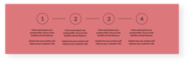
Present the offer – after the opening section(s), it’s time to say a bit more about the core of your landing page – the offer. Include the most attractive benefits you have to offer and illustrate them with icons or pictures, whatever seems more appropriate.

Additional information and a form – we’re near the end of an exemplary landing page. You can now add all the things you believe should be included on a landing page and end it with a conversion form. You can find more about the latter in the next lesson.

Include testimonials – the next spot would work great for user testimonials. Add their pictures, short opinions, and don’t forget to include the reviewers’ full names if they gave you their consent.

Of course, the list above is just an example of how you can arrange your landing page. Try out different ideas, make changes according to your needs, and don’t forget about the goal – do whatever you can to achieve it.

While creating your landing pages, you may rely on templates entirely, but there’s also some space to experiment. Here are some tips on how to design your landing page:

  • No navigation – landing pages need to be focused on a single goal, which means adding navigation or links to other websites or products is a bad idea. It results in distraction and leads to users leaving the landing page instead of converting.
  • Be consistent – Notice that usually, landing page templates use a few colors – two, three, maybe four. Stick to them and create a landing page that’s easy to look at. Also, make sure that all the buttons share the same color, shape, copy, and goal. It may be getting boring, but the most effective landing pages are designed to achieve one goal, so if you’ve got three identical buttons on a page, there will be no confusion on the visitor’s part. Also, make sure they all link to the same point.
  • Avoid overloading – a landing page has to be short; otherwise, you’ll lose visitors. Also, it has to load super fast because every delay results in users leaving the page. A small amount of elements, only crucial information, and well-optimized visuals – these are the keys.
  • Don’t stop A/B testing – there’s no such thing as a perfect landing page. You can always find something to mess around with and eventually get better results. A/B testing takes some time, but it’s the best way to squeeze the most out of your landing pages.

Landing page design tips

Share Your Thoughts and Get a Free Landing Page Checklist!

Let us know what you think about Landing Page Academy, and we’ll send you a handy Landing Page Checklist in return. The checklist will help you make sure your landing page is ready to rock!

DOWNLOAD

FREE PDF

Takeaways

Designing a landing page might seem challenging at first, but once you learn the steps and find your rhythm, it will become a lot easier. Of course, having the right tool can make a huge difference.

1. Create a mock-up before building your landing page.

2. Add all the crucial elements to the page….

3. ...and remove everything else, like a navigation bar or external links.

4. Reserve some time to test the page after publishing.

Building a High-Converting Form

Next lesson

Landing Page Academy

More lessons

What's next?

The final lesson of this Chapter focuses on one of the most crucial elements of lead generation landing pages – forms.