
'Success in e-commerce'
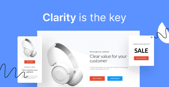
Lesson 1: Clarity is the key


Visuals matter, but even a poorly designed landing page can convert reasonably well. Clarity is the key.
When the visitors see that the page is an extension of the ad, the goal of the page is described and the next step is outlined, conversion is more likely to happen.
How to achieve this? Your landing page should be focused on:
So, how do you start?
Having clearly defined the above 3 points, flip them upside down, and let’s go to work:
Begin all your work by defining your call to action (CTA) as a core element and then, design your landing page around its message.
The CTA button should send a clear instruction in just a few words, telling your visitors what to do, and the message around it should be directed to your visitors’ needs, showing them why they want to click on that button.
Write a copy outlining the benefits of your product to a specific persona.The message of your Landing Page should be personalized around the selected persona’s needs. Remember to include social proof in the form of videos, testimonials, or reviews.
And, lastly, decide how to display your product. Remember: images speak louder than words.


Want to see the examples of the above tips in use?
The exact CTAs, copies, product expositions, and even more???
Visit our blog post:
Have a great read and let’s continue on the Next Lesson :)